15 Exterior Brick Paint Color Ideas to Transform Your Home
Explore 15 transformative exterior brick paint colors that can boost your home’s curb appeal. Find fresh ideas, from classic neutrals to bold statements, to make your brick exterior pop.
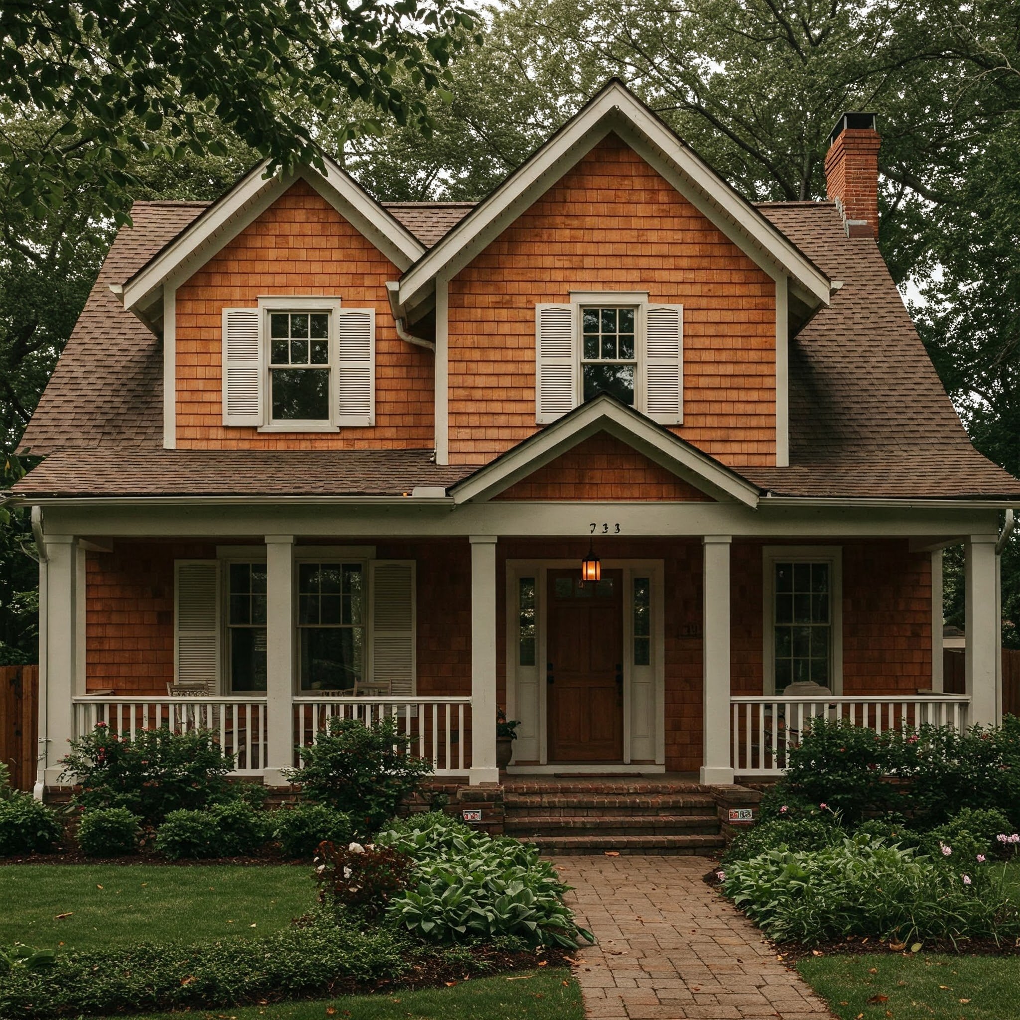
Have you ever strolled through a neighborhood and felt a sudden jolt of admiration at a stunning brick home? Maybe it was the color that caught your eye—one that perfectly complemented the architectural style and surrounding landscape. Painting exterior brick can breathe life into an older house or give a brand-new twist to a familiar façade. It’s like wrapping your home in a fresh outfit that mirrors your personal taste. But how do you select the right hue? And what if you want to stand out without going over the top? Relax. This article unpacks 15 dynamic paint colors that can turn a traditional brick exterior into a show-stopping spectacle. Ready to discover the perfect palette for your abode? Let’s dive in!
1. Crisp White Brilliance
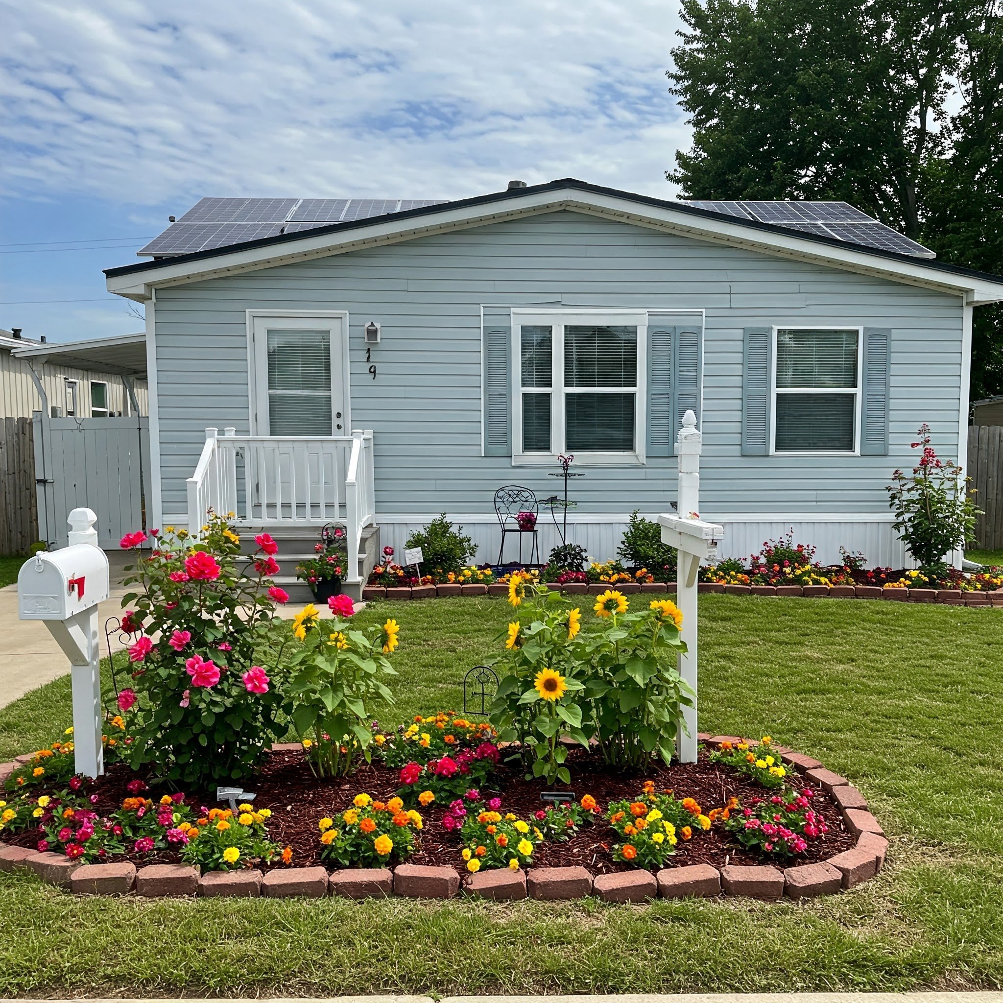
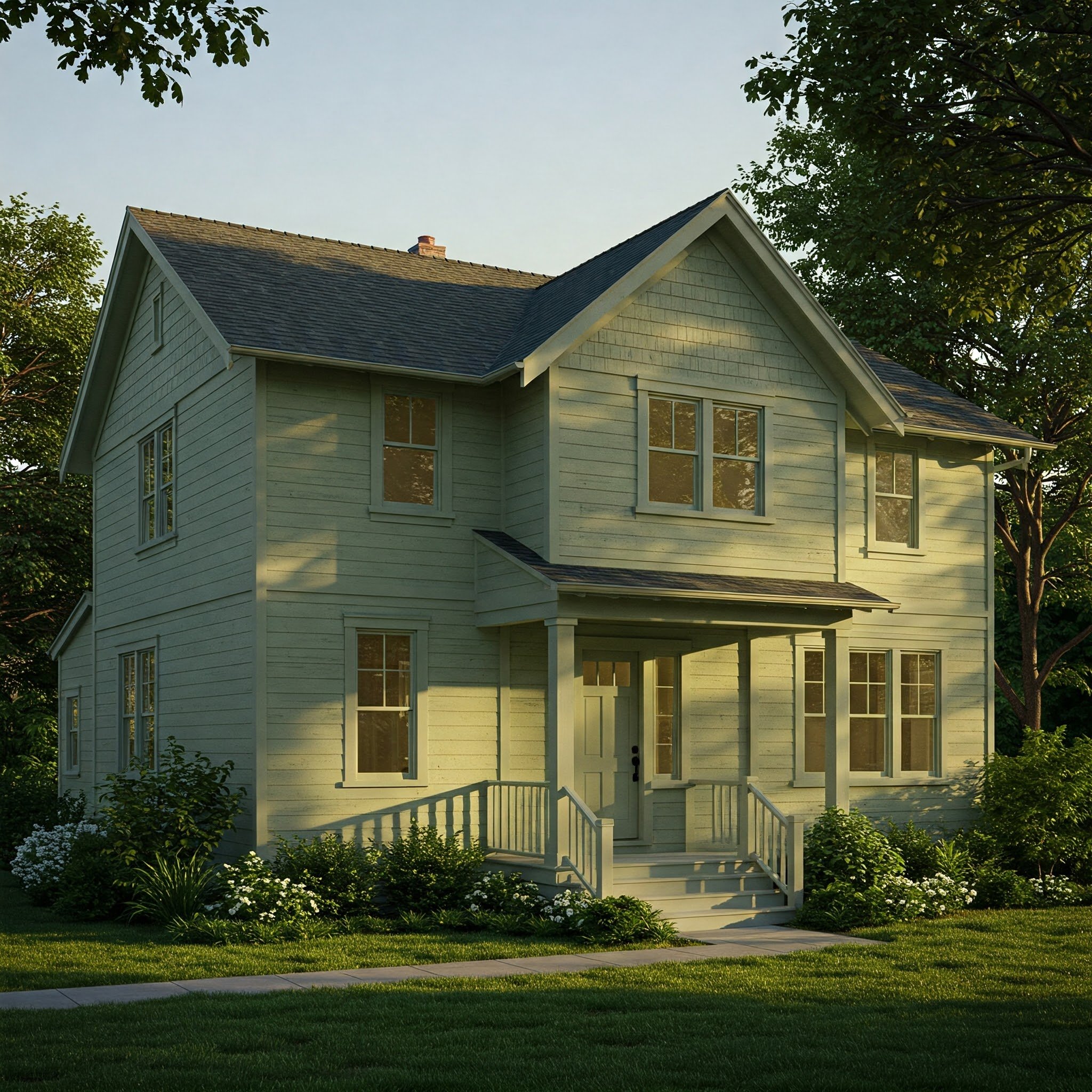
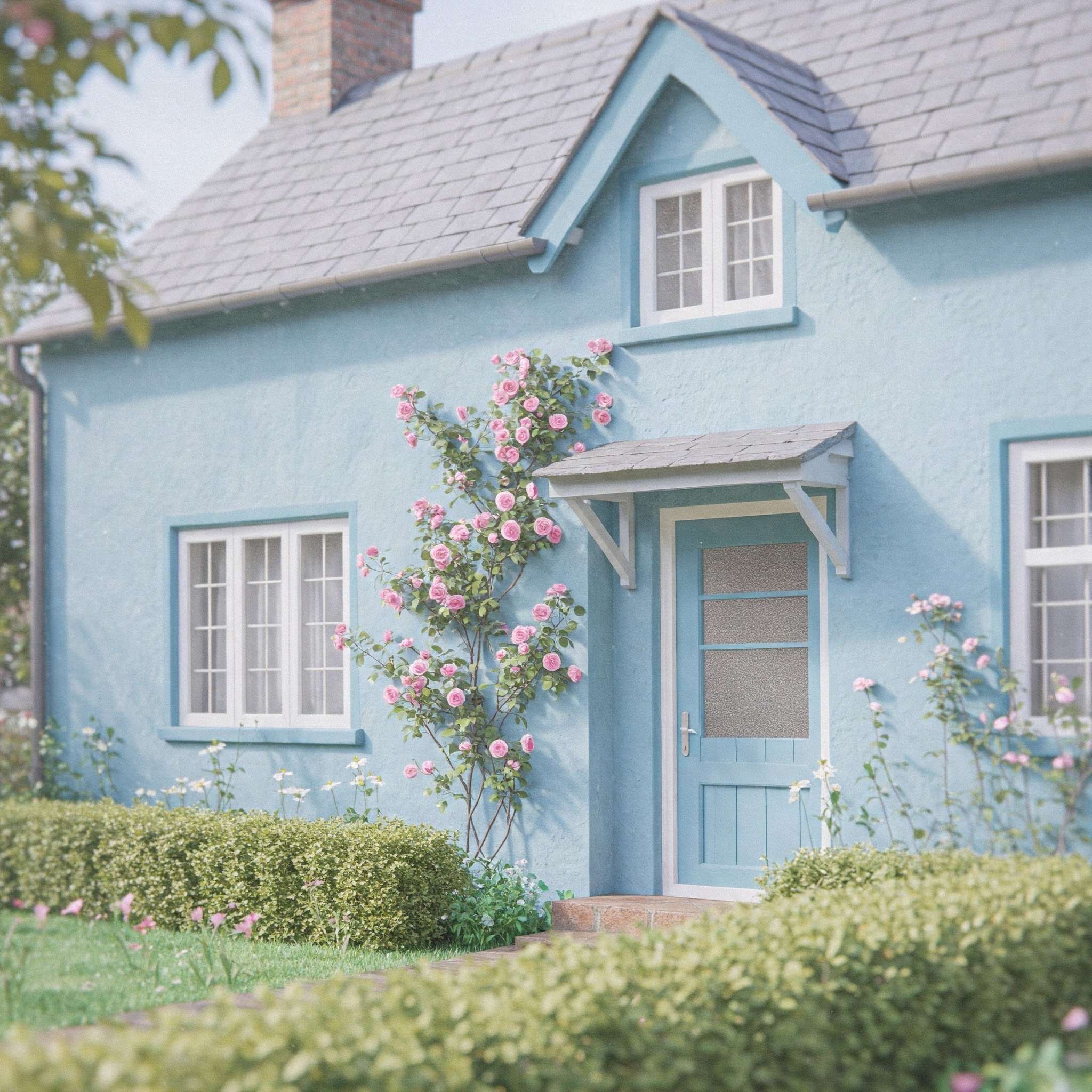
Painting brick white is like giving your home a crisp, freshly laundered shirt. It instantly revitalizes the façade, making windows, shutters, and decorative trim stand out. The result? A bright and welcoming exterior that exudes both modern flair and timeless elegance. If your home sits in a lush, green environment, the contrast can feel downright cinematic—imagine white walls peeking through a canopy of trees, like a beacon of serenity. Another perk of white is its remarkable versatility. Whether your architectural style leans cottage, colonial, or contemporary, white can adapt gracefully. You can also play around with different finishes—matte for a more subdued look or a slight sheen if you prefer a polished vibe. Ultimately, white is a color that whispers sophistication without shouting for attention, making it a perennial favorite.
2. Classic Charcoal Elegance
Charcoal brings a dash of drama that can elevate the character of any brick home. Think of it as slipping your house into a tailored charcoal suit—confident, sleek, yet undeniably warm. This shade tends to pair beautifully with crisp white trim, black accents, or even a pop of red in the front door. If you’re aiming for an exterior that balances timelessness with a modern edge, charcoal is a fitting choice. It also has a way of highlighting architectural features like arched windows or intricate brickwork. By offering a dark backdrop, it sets the stage for smaller details to shine. Worried about it appearing too imposing? Lighten the rest of your palette with neutral landscaping—like light stone pavers or pale fencing—to keep the overall look inviting. Charcoal is all about subtle sophistication, and it rarely disappoints.
3. Soft Greige Calm
Caught between gray and beige, greige is the understated sweetheart of neutral palettes. If white feels too bright and gray too cool, greige is your color match—a gentle, welcoming shade that feels like a cozy hug. Painting your brick in this hue softens hard lines, blending seamlessly into a variety of neighborhoods and landscapes. Consider pairing it with creamy trim and warm wood accents for an atmosphere that’s both contemporary and homey. Another bonus: greige adapts with the light, sometimes appearing more beige in direct sun and more gray on cloudy days. This chameleon-like quality adds depth and keeps your exterior from looking flat. If you crave a timeless façade without going the traditional white route, soft greige offers a refreshing alternative that exudes quiet confidence.

4. Muted Sage Green
Sage green is like a breath of fresh air—it’s subtle enough to serve as a neutral yet distinctive enough to command attention. Painting a brick exterior in this muted green creates an immediate connection to nature, making your home look like it’s part of the surrounding foliage. Think of it as inviting the garden right up onto your walls. Soft sage pairs beautifully with off-white trim, rustic wooden shutters, or even black accents if you’re feeling bold. This color’s gentle undertones ensure that it blends with various architectural designs, whether you have a quaint bungalow or a modern farmhouse. If you want a unique twist without stepping too far from tradition, muted sage green strikes that perfect balance: it’s cheerful yet calm, simultaneously blending in and standing out.
5. Striking Navy Blue
Navy blue is the color equivalent of a perfectly tailored blazer—sharp, versatile, and effortlessly stylish. Painting your brick exterior in navy can completely transform the home’s vibe, lending it a sophisticated aura that demands a second glance. If you’re feeling adventurous, pair it with white trim and a bright door—maybe in a contrasting color like mustard yellow—for a touch of spirited flair. But if minimalism is more your speed, black or dark gray accents can keep the overall look sleek and modern. Navy’s depth helps it adapt to different lighting conditions, appearing nearly black at night and vibrant when the sun hits. Plus, it works well across various architectural styles, from Victorian to contemporary. Feeling bold? Go navy. It’s a statement that exudes confidence without losing an ounce of charm.

6. Warm Taupe Comfort
Taupe is the color that seems to say, “Come on in and get comfortable,” the moment you see it. When used on brick, it creates a cozy yet refined aesthetic that plays wonderfully against earthy landscaping. Think about the way wood beams or stone walkways could complement a taupe backdrop, enhancing that homey vibe. It’s a shade that hovers between beige and gray, often picking up warm undertones in natural light. For trim and door accents, you might choose crisp white for a classic look or go bolder with charcoal or muted green. Either way, the effect is one of understated elegance. If you’d like a color that subtly evolves through the seasons—looking a bit cooler in winter and more golden in summer—warm taupe might be your perfect match.

7. Timeless Off-White Blend
If pure white feels too stark, an off-white blend might be your new best friend. This hue has a softer edge, like a whisper of cream blended into white paint. When applied to brick, it brings all the brightness of a white façade but with a gentler, more inviting tone. Off-white can highlight architectural details—like cornices, columns, or porch trim—by creating a delicate contrast, especially if you choose slightly darker accents. It’s also a forgiving color in various lighting conditions: on cloudy days, it warms up a bit, and in bright sunlight, it still looks clean without blinding passersby. If your home sits near water or surrounded by greenery, off-white reflects the setting’s natural light, amplifying a calm, coastal or country vibe. Essentially, it’s the best of both worlds—radiant but reassuringly soft.

8. Earthy Terracotta Tones
Terracotta might remind you of Mediterranean villas basking in the sunshine, and that’s exactly the vibe you can bring to your own brick exterior. This color sits in the warm, reddish-brown family, radiating a down-to-earth charm that’s simultaneously relaxed and captivating. Painting your brick in a terracotta tone can create a unified look if you’re already a fan of clay roof tiles or earthy landscaping elements. Pair it with wrought-iron details or wooden shutters for a nod to Old World romance. Alternatively, keep it modern by adding contemporary lighting fixtures and sleek hardware. Terracotta’s warmth also plays well with natural stone walkways, southwestern-inspired gardens, or desert-style succulents. It’s a hue that whispers of sun-kissed afternoons and long, lazy weekends, all while giving your home a distinctive, captivating presence on the block.

9. Bold Black Sophistication
Black is undeniably bold for exterior brick, but executed well, it can give your home a dramatic presence reminiscent of sleek urban residences or edgy modern builds. Think of it as a tuxedo for your house—a statement of refined style that demands attention. To balance the darkness, consider pairing black brick with light-colored trim, large windows, or even a natural wood front door. This interplay of stark contrasts keeps the look from veering into gothic territory. You’ll also find that black can accentuate architectural lines, making certain features pop—like a pitched roof or ornate molding. If you’re worried about it absorbing too much heat, newer paint formulations can reflect UV rays to minimize temperature issues. When you want to create a sense of modern luxury or creative edge, black is your confident, show-stopping choice.

10. Dreamy Dusty Blue
Dusty blue is like a hazy morning sky: soft, soothing, and quietly mesmerizing. Applying this color to your exterior brick can evoke a sense of calm that’s particularly appealing in busy neighborhoods or hectic urban settings. Imagine driving up to your home and feeling instantly relaxed by its gentle hue, much like watching clouds drift lazily across a sky-blue canvas. Pair dusty blue with warm white or cream trim to keep the overall vibe light and airy. If you want a dash of contrast, darker window frames or a deep navy door can add depth. This color also works harmoniously with stone, gravel walkways, or cottage-style gardens. Whether your architecture leans Victorian or Craftsman, dusty blue brings a subtle whimsy that hints at serenity and timeless charm.
11. Subtle Grey-Blue Fusion
If you appreciate the tranquility of blue but crave the sophistication of gray, a grey-blue fusion may be just the ticket. This color melds the best of both worlds, creating a hue that can feel nautical under a bright sky or moody on an overcast day. Painting your brick exterior in a grey-blue tone can be especially striking if your home has dormer windows, columns, or decorative eaves, as the color’s ever-shifting undertone highlights these features. It’s a shade that pairs nicely with neutral or bold accents—think crisp white shutters for a clean look or wooden elements for an organic contrast. Plus, grey-blue tends to age gracefully, maintaining its understated elegance through changing seasons. If you want a subtle yet distinctive look, a grey-blue blend is a sophisticated, nurturing choice.

12. Cozy Cream Undertones
Cream is a color that feels warm and comforting, akin to a dollop of rich cream stirred into your coffee on a cold morning. When used on brick, these undertones add depth, preventing the façade from looking flat. Cream is less stark than pure white, but it still illuminates your exterior with gentle brightness. This hue pairs harmoniously with darker shutters or bold front doors in shades like navy or forest green, creating an inviting contrast that draws the eye. Alternatively, keep the palette neutral by opting for soft gray or beige accents. Cream also adapts well to landscaping choices, from manicured boxwoods to colorful flowerbeds. If you want your home to radiate warmth without shouting, cream undertones offer a serene, approachable aesthetic that stands the test of time.
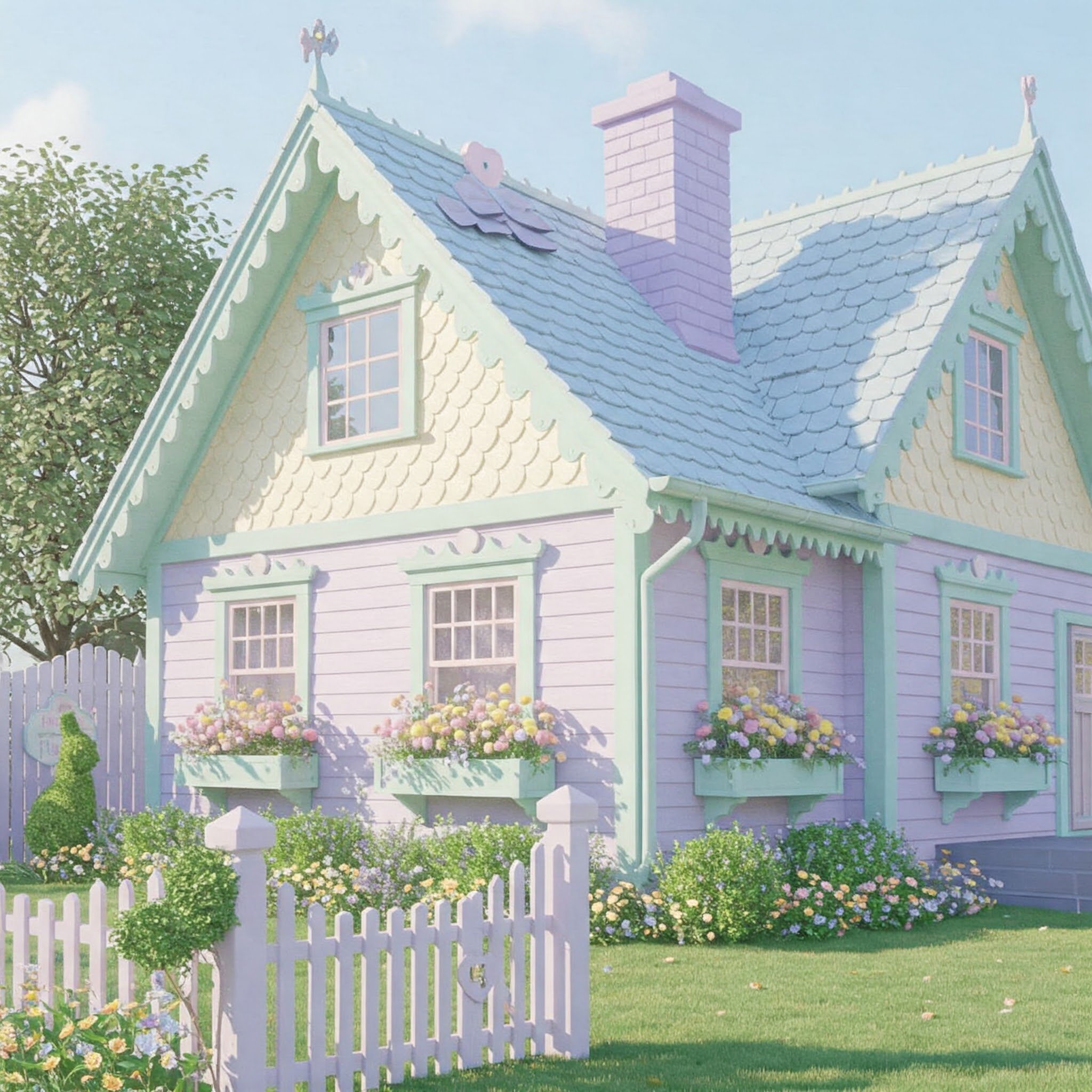
13. Whimsical Pastel Neutrals
Pastels aren’t just for Easter eggs or baby nurseries; they can also breathe life into a brick exterior that yearns for a touch of whimsy. Think pale lavender, blush pink, or a barely-there mint—colors that flirt with your senses without overwhelming the street view. The key is to ensure your pastel of choice has neutral undertones, preventing it from looking too candy-like. Pair these gentle hues with crisp white trim for a clean, fairy-tale vibe, or anchor them with darker shades of gray or bronze for a more grown-up twist. Pastels can also spotlight greenery, making your home pop amid lush trees or budding gardens. If you’re feeling playful and want to stand out from the neighbors—in the best way possible—pastel neutrals offer a charming route that’s sweetly unexpected.
14. Energetic Brick Red Revival
It might sound ironic to paint brick in brick red, but a fresh coat of red can enliven an aging or faded exterior. Think of it like giving your home a brand-new identity while staying true to its original character. Red exteriors exude a classic, all-American charm—especially when paired with white trim and a welcoming porch. To modernize this look, you can choose a deeper, richer shade of red or pair it with industrial lighting fixtures. Whether your style is colonial revival or farmhouse chic, red has a way of making your home appear both nostalgic and spirited. Just keep your landscaping in mind; vibrant green plants or a well-kept lawn provide the perfect complementary backdrop. If you want a color that practically waves hello to passersby, you can’t go wrong with a bold red revival.

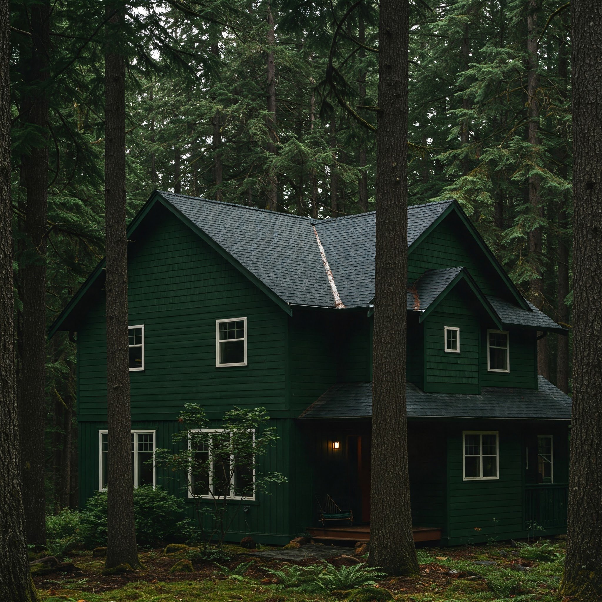
15. Deep Forest Green
Forest green merges the cozy allure of wooded landscapes with a dash of fairytale enchantment. Painting your brick exterior in this deep hue can create a cabin-like atmosphere, even in the heart of the suburbs. Forest green is striking when combined with natural elements like stone pathways, wooden pergolas, or wrought-iron railings. For a modern twist, try pairing it with black window frames and sleek metal fixtures, giving your home a refined edge. This color also adapts well to changing seasons: it feels refreshingly cool under summer sunlight and dramatically elegant on a frosty morning. If you have surrounding trees or gardens, the synergy of green on green can be breathtaking, as though the house sprouted right from the earth. Ultimately, forest green lends an inviting, nature-inspired charm that’s hard to resist.
Conclusion
Choosing an exterior brick paint color can feel like a major leap of faith, but the rewards are often profound. It’s the difference between a house that blends into the background and one that stops people in their tracks, eliciting nods of appreciation. Whether you’re leaning toward crisp neutrals like off-white or pushing boundaries with bold options like black or navy, the key is to pick a shade that reflects your personal style and complements your home’s architecture. From the soft serenity of dusty blues to the earthy romance of terracotta, each hue offers its own character and transformative power. So take your time, gather samples, and watch how each color plays with natural light. With a careful eye and a bit of daring, you’ll soon have a refreshed, memorable façade that truly feels like home.
Frequently Asked Questions
1. Will painting my brick exterior require a lot of maintenance?
Generally, it needs occasional touch-ups, but choosing high-quality paint designed for masonry can minimize peeling or chipping. Also, a pressure wash every few years can help keep it looking fresh.
2. How do I decide between warm and cool tones?
Consider your environment. Warm tones stand out brilliantly in cooler climates, while cooler tones can temper hot, sunny locales. The best approach is to swatch several colors and observe them in different lighting.
3. Can I paint my exterior brick by myself, or should I hire a pro?
It depends on your comfort level. Painting brick is more time-intensive than painting regular siding. Hiring professionals ensures even coverage and proper sealing, but avid DIYers can tackle it with the right prep.
4. What if I change my mind about the color later?
That’s okay—paint isn’t permanent. You can repaint in the future, although you’ll want to plan for thorough prep, including cleaning and possibly sanding or priming again.
5. Will painting my brick reduce its breathability?
High-quality masonry paints are formulated to be breathable, allowing moisture to escape. Be sure to select a paint labeled specifically for brick or masonry to avoid potential issues with trapped moisture.